Interlochen Center for the Arts

Author: Oliver Hale (Page 2 of 3)

The Titles in Adventures of Tintin

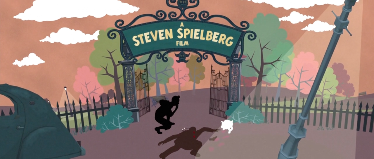
Titles are never something I thought about until watching this movie. It felt like it introduced the character so well, even though I was already aware of the character of Tintin, I fell in love all over again. the style and the simple silhouetting and composition just added to the vibe so well.

while i couldn’t find exactly what inspired Denis Yoo to make such an incredible title card, i did learn a lot more about him.

Dennis has been in the VFX and animation game for 20 years now, starting off his career with Weta FX, animating creatures in the Lord of the Rings and Avatar (the blue one) When Weta FX was hired to help design and make some of the visual effects for Adventures of Tintin, I can only speculate how his job of designing the title sequence fell into place.

Since there have been no clearly stated inspirations, I can only pull from what I know Weta FX has worked on. One of which is the intro and credits for Disney’s The Jungle Book. While Dennis was not on this project, I’m sure he took inspiration from it in terms of developing his composition for the Adventures of Tintin title screen.

Although there is no official inspiration stated, I can take a guess. i looked for other examples of comics that were then adapted into film. such as in Batman the Animated Series. I picked this one in particular because of its strong use of silhouetting.

while looking for more information about comic book-esque title sequences I came across this interview by the creator of Aeon Flux, Peter Chung. to my surprise he had mentioned Herge the author of the original Tintin comics  

I [peter] was looking at a lot of Moebius at the time, I had actually gotten to know him and work with him on a project early in my career. I really admired and was inspired by him as an artist. What I love about his approach to comics and graphic illustration in general is that it has a clarity to it. The term in French for that is “ligne claire”, which means clear line. The main practitioner of that was Hergé, the creator of Tintin. It’s a style that’s very descriptive, and what that means is approaching the subject with a certain amount of graphic neutrality.

while it is unknown how much of the original comics inspired the intro style in Adventures of Tintin, I do know that art comes full circle if you let it.

https://www.youtube.com/watch?v=_ZfwSyWhhGc&ab_channel=dedevovo31

sources

https://www.imdb.com/title/tt0983193/fullcredits/?ref_=tt_cst_sm

https://www.artofthetitle.com/title/the-adventures-of-tintin-2011

https://www.wetafx.co.nz/about/people/animation-supervisors/dennis-yoo

https://www.artofthetitle.com/title/aeon-flux

Masaki OKUDA

Japanese independent indie animation has many great giants, shoulders on which we all stand upon. One of these greats is Masaki Okuda, whose take on various themes of childhood and growing up takes bizarre turns through his unique filmmaking lens.

As the Cartoon Brew says in their review of Gum-Boy “through a creative and non-literal use of animation that marries the fluid grace of a watercolor style with frenzied use of camera and cutting. Okuda’s mastery of film technique, narrative and visual style elevates Gum Boy beyond the average student film, and for that matter, the average professional short film as well.” I believe this illustrates Okuda perfectly.

Themes previously mentioned consist of childhood and something everyone experiences at least once: ostracization. This particular theme is the main lens through which we watch Gum-Boy. Gum-Boy is Okuda’s 2010 hit student film. The frenzied camera cuts, along with the blur of beauty that is his watercolor frames add up to an incredible student film. stylistically, you can see his frame boils in many other of his films not just in Gum-Boy. A film he was commissioned to make for the 2011 exhibition Art Path, called Count Down also includes these frantic frames. often flipping between one or two slightly different drawings to make this effect. This style works well in portraying the particualr intensity of the emotions featured in Okuda’s works.

while his work does not have a distinguishable cultural impact it reminds me of the type of animation that erupted out of the production of Dragon Ball. In particular, in scenes that show the intense power of the characters, the same frame boil can be seen similar to Okuda’s work.

An anime series I admire for its creativity and world-building is one I have only just started but have fallen in love with. Vinland Saga tells a dramatized version of a Viking story of revenge, and I love it. The animation and FX are particularly well-made.

sources

http://masakiokuda.com/en/profile/

https://en.wikipedia.org/wiki/Vinland_Saga_(manga)

https://en.wikipedia.org/wiki/Dragon_Ball

https://www.cartoonbrew.com/shorts/a-gum-boy-by-masaki-okuda-77199.html

What Lurks in the Dark

https://www.youtube.com/watch?v=UjgHbRrnjhU&ab_channel=dubiella

My director was Paul Berry, and his stop motion animated piece, The Sandman. while watching the film, I had a sudden flood of memories about my own childhood fears. That is what makes the film successful; everyone has had the feeling of anxiety about the dark. The things that go bump in the night. Paul does an amazing job framing it as a child would see it. An impossibly long winding staircase and a door that is just so out of reach. it frames the story perfectly

The story here is of an old European folk tale. this particularly is derived from the Sandman in E.T.A Hoffmanns story. what the book and the film share is a childhood fear of the dark, the presence of something you can’t see or that is always out of view.

“Eh, Natty,” said she, “don’t you know that yet? He is a wicked man, who comes to children when they won’t go to bed, and throws a handful of sand into their eyes, so that they start out bleeding from their heads. He puts their eyes in a bag and carries them to the crescent moon to feed his own children, who sit in the nest up there. They have crooked beaks like owls so that they can pick up the eyes of naughty human children.

-E.T.A Hoffmann

another example of Paul Berry’s work can be found in other classic creepy stop-motion films such as James and the Giant Peach and the Nightmare Before Christmas. His beautiful animation on the sandman brought him to work as an animator for those two films as well as others.

My favorite horror-tinged animation is a popular web series called lamas with Hats. In which two lamas grapple with one’s extreme homicidal tendencies.

Sources

https://www.imdb.com/title/tt0105311/?ref_=nws_nwr_hd

UPA and animation in the 1950s

for my UPA animation, I was struck by the moral complexity of the UPA cartoon Brotherhood of Man.

the Brotherhood of Man is a short cartoon based on a pamphlet of the same name. the pamphlet was written by two anthropologists, Gene Weltfish and Ruth Benedict. The cartoon was commissioned by United Automobile workers to ease the ethnic tensions in the unionized southern branches. its depictions of other races as stereotypical caricatures are and will continue to be harmful.

to maintain the same age of cartoons, I chose the Native American scene in Peter Pan. Both of these films were produced in the 1950s and have harmful depictions and stereotypes of the races shown. while the animation style differs wildly as does the message. while the UPA film seeks to connect people over their similarities rather than differences. While as Peter Pan’s scene was used as a plot device to move along the story between Wendy and Peter.

in terms of considering the actual style of the animation, we have the classical Disney style in which these movements are fluid and real. The characters in Disney films, while being stylized, are more human than their UPA counterparts. Yet the Disney character of the chief is a racist stereotypical depiction of a Native American. As opposed to the appealing character design of, say, Wendy Darling. As Disney does, the film’s animation brings the story book to life, but at a cost of displaying harmful stereotypes. whereas UPA’s style while it plays into the stereotypes, it seeks to dismantle the views around them rather then let them continue to exist. I’d like to be incredibly clear in my beliefs surrounding both animations, they consist of harmful imagery and stereotypes but the message of UPA’s film stands out to me. while the fact we still deal with the same issues saddens me, art continues to give me hope that we can learn more about one another.

“the message that the similarities between people are greater than any racial differences, was part of a post WW2 optimism which was soon to be seen as leftist propaganda and now reads like simple multiculturalism.

UPA’s personnel and writer Lardner jr. (CLOAK & DAGGER, TOMORROW THE WORLD) soon came under the scrutiny of the McCarthyists.”

-anonymous critic

SPONSOR: United Auto Workers

PRODUCTION CO: United Productions of America

DIRECTOR: Robert Cannon

WRITERS: Ring Lardner Jr., Maurice Rapf, Phil Eastman MUSIC: Paul Smith

Robert Cannonanimator
Boris Gorelickbackground artist
Ken Harrisanimator
Ben Washamanimator

sources

https://www.imdb.com/title/tt0162213/?ref_=rvi_tt

Animation and supporting ideas through documentary


The documentary-style video that I chose is from Ted-Ed about the Berlin Wall. This is an explainer-type video, but what it does with the animation is something unique that I’ve only seen with Ted-Ed. it shows an emotive side of history. the people we see in the video are living through these events. The animation shows that! the video is informative and features beautiful animation by Kyriaki Kyriakou, Remus Buznea, Mitko Karakolev.

Meet The Creators

  • Educator Konrad H. Jarausch
  • Director Kyriaki Kyriakou, Remus Buznea
  • Script Editor Alex Gendler
  • Animator Kyriaki Kyriakou, Remus Buznea, Mitko Karakolev
  • Art Director Kyriaki Kyriakou, Remus Buznea
  • Sound Designer Ana Roman
  • Composer Ana Roman
  • Associate Producer Jessica Ruby
  • Content Producer Gerta Xhelo
  • Editorial Producer Alex Rosenthal
  • Narrator Addison Anderson

sources

https://ed.ted.com/lessons/the-rise-and-fall-of-the-berlin-wall-konrad-h-jarausch

« Older posts Newer posts »